Pay in 2012 was $24,000. In 2013 it was about $25,000. In 2014 it was about $27,000. In 2015 it was about $27,500. In 2016 it was about $28,500. In 2017 it was about $28,500. In 2018 it was about $29,000. In 2019 it as about $30,000. In 2020 it was about $31,000. In 2021 it was about $31,500. In 2022 it was $32,000.
Find a linear equation that approximately models the above situation. Use \(P(t)\) to represent Nelson’s pay in dollars and \(t\) to represent the number of years since 2012.
Nelson is using extrapoloation to predict his future salary, so his prediction is unlikely to be perfect and could even be quite a bit off. Extrapolation is the process of using a mathematical model to make predictions that are outside the range of the available data, based on the assumption that existing trends will continue. The problem with extrapolation is that the trend could change in the future, for any number of reasons, which would make the prediction unreliable. Give at least one example of way that the trend in Nelson’s salary might change and result his prediction being very wrong.
Every year, the Berkeley Earth Surface Temperature (BEST) project releases an analysis of land-surface temperature records (some going back as far as 250 years). 2
According to Berkeley Earth, “The analysis shows that the rise [or growth] in average world land temperature[is]... about 1.3 degrees Celsius.” BEST states that “global warming is real,” and attributes the temperature trend to a combination of volcanoes and CO2.
There are others who are skeptical of the theory of “global warming” and hold a contrary view of weather data. These people believe that there are other explanations and reasons for the climate changes being experienced. In the next two activities, we are going to examine the Berkeley Earth project data and linear models for Global Surface Temperature Change to study the issue of global warming.
On the website skepticalscience.com, the data from the Berkeley Earth project has been used as the source for two different analyses of the same information. The first one is labeled “How Realists View Global Warming”> and the other is “How Contrarians View Global Warming.” The two infographics are reproduced here. You will see that each includes a line or line segments along with the actual data. Use these infographics to answer the following questions.
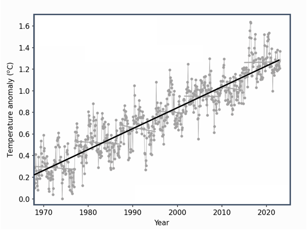
Below is an infographic showing the data gathered by BEST showing the monthly “Global Temperature Anomaly” (that is, the change in average Global Temperature, in degrees Celsius) for the years 1970-2022. It is stated on the project’s website that the baseline period is the 1850-1900 mean. 3
The temperature difference has a lot of variation over short time periods, but over the entire 1970 to 2022 time period, the differences tend to increase. Exact points on the trend line are hard to estimate, but it appears that (1970, 0.21) and (2022, 1.28) are both approximately on the line.
Figure4.2.3.Difference in average global temperature from the 1850-1900 mean with a trendline. Image from Quantway College Module M.3 by Carnegie Math Pathways
Estimate the value where the trendline crosses the vertical axis (we will treat this as the value in 1970). Describe the meaning of the point where the trendline crosses the vertical axis.
Estimate the slope of this line in degrees Celsius per year (although the original data is monthly, the slope will be per year). Write an interpretation of the slope in this context. Be sure to use units with your values, and use complete sentences. Finding exact points on this line is difficult. Just do your best to estimate two points and use them to find the slope.
Using your linear equation from above, predict the temperature change at the end of 2030. Also predict the temperature change at the end of 2050. Do you think this is a reliable prediction for 2050? Why or why not? Explain using complete sentences.
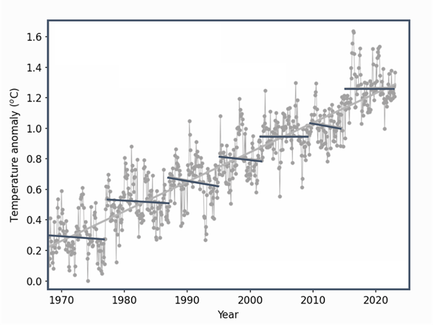
The infographic below contains the same data points for the Global Temperature Change (the change in average Global Temperature in the years from 1970-2022) that were included in the infographic showing “How Realists View Global Warming.” This infographic is meant to depict a common view stated by contrarians that global warming is not real since there have been several periods over the last 50 years when global temperatures have declined on average.
The temperature difference has a lot of variation over short time periods, but over the entire 1970 to 2022 time period, the differences tend to increase. There are seven short-term trendlines shown, each of which is either decreasing or roughly horizontal. The trend line from 2010 to 2015 starts at about (2010, 1.1) and ends at about (2015, 0.9).
Figure4.2.4.Difference in average global temperature from the 1850-1900 mean with a piecewise model. Image from Quantway College Module M.3 by Carnegie Math Pathways
Also shown is a piecewise model, which is a model defined by multiple pieces, each of which has its own trendline that represents the trend of the data within a certain interval. This infographic shows a linear piecewise model that consists of 7 line segments - each of which can be considered a trendline for that restricted time period.
Now look at just the segment of the piecewise “best fit” model from 2010 to 2015 (the line segment second farthest to the right). Estimate where the line segment would cross the vertical axis (in year 1970). (Hint: It might be useful to use a straight-edged item to extend the line to the vertical axis. You can see the line is very slightly slanted.)
Explain what the Contrarian Model is saying about the general pattern of global temperature. Is it rising or falling? Think about this on your own for a minute before sharing your ideas in your group.
If you look at the overall trend of the data in the infographic, it is increasing. However, each line segment in the piecewise model is decreasing (ever so slightly). What does this mean? Explain what the model is saying about the general pattern of global temperature change.
Come up with an example of a similar piecewise linear model. Note that models can be represented in different ways - tables, graphs, written descriptions, or equations. We will explore piecewise models in the next lesson.